Since the latest episodes of both Bent and Throw it Against the Wall have seen me mention Windows Phone 7, I think it’s about time I talk about why I like it. I know there’s a lot of scepticism surrounding it. And why not? Most people I know who were considering jumping the Microsoft ship did so in the dark days of Vista, so that’s their last experience with Windows. Anyone who saw their parents working on a Treo back in the nascent days of the Blackberry know the sloppy, malfunctioning horror that was Windows Mobile 6.5.
There’s a messy pedigree there. And with technology becoming increasingly homogenous in terms of features and capability, people are right to ask why they should want to go back.
It took me a while to figure out why I love Windows Phone as much as I do, and why I’m so excited about Windows 8. And it goes back to Windows itself, and the philosophy behind its naming in the early days of home computing.
Imagine yourself in the beige box days of computers.

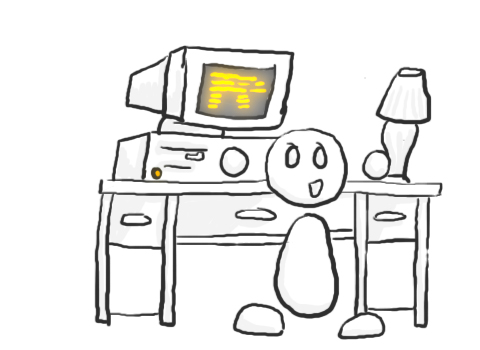
I was fortunate enough to be in a house that had a computer from the first days (well, my first days)—my folks had one for work and upgraded frequently (from 386 to 486 to an early Pentium, each one becoming more in line with current tech). And at school, we had tons of classic Apple Macintosh computers. So far from being bred into an ecosystem, I got in on the ground floor with both systems. As the home computers got better, we slowly evolved at school into Power Macs, then candy-coloured iMacs and beyond.
While I remember vividly the Number Munchers and desktop publishing on Macs through the years, something about having “Windows” at home spoke to me.
Imagine the pre-internet home computer model (especially from a child’s perspective). You’ve got the computer box, where all the stuff goes.

Then, you’ve got the monitor, which lets you look at all the stuff you’ve got in the box.
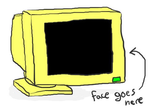
The file structure of the computer always seemed a little like different rooms to me. You go in the front door of the big house that is your computer when you turn it on. You go into the foyer, to your desktop, and from there to different rooms.
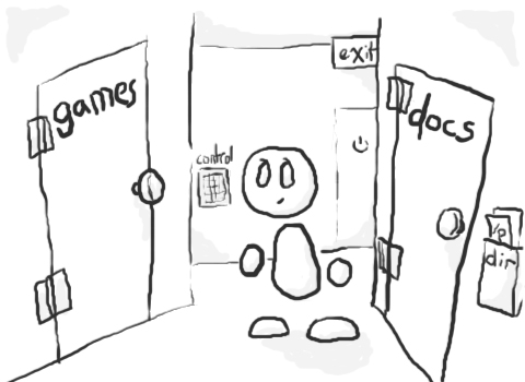
The Windows name made sense to me. I’m not really in the computer, of course, but I can look into each different room through a special window.
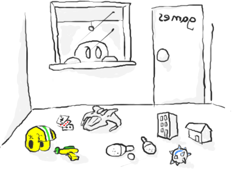
Now, it doesn’t do you much good to have a window going from one room into another. But you were only ever inside your computer in the pre-internet days. When the internet came about, you got the opportunity to get out of the house and run down the street and poke around in other houses, and there was, for Windows users, an icon that became your front door.
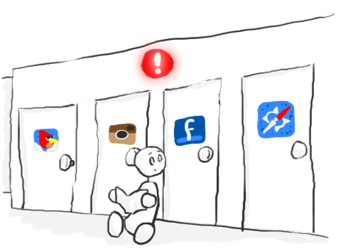
Smartphones, at least since the iPhone, are characterized by always-on data connections and being constantly connected to different apps, services, and people. But even when the iPhone launched, we were still working with variants of the rooms analogy, only now, instead of windows, we got doors.
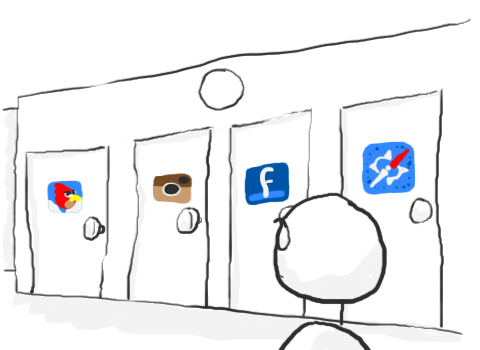
And sure, plenty of these doors had awesome stuff delivered to you when you went through the door.
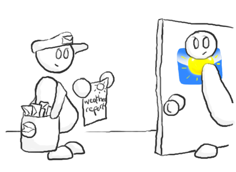
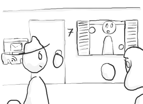
Sometimes, there’s even a knock at the door to let you know when something’s arriving.
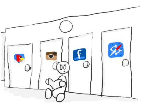
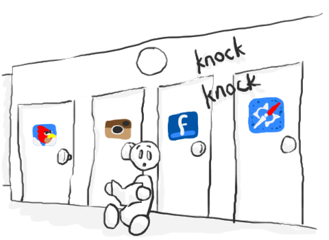
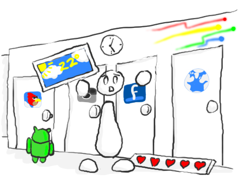
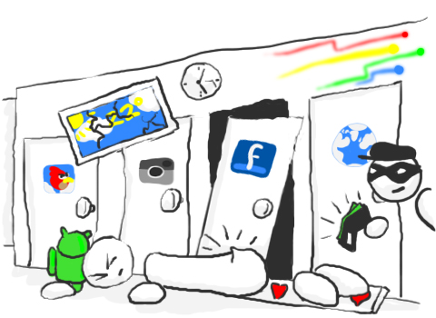
I was really excited by the prospect of Android, following the debut of the iPhone. Not only would you be able to go through all of the same kinds of doors, but you could cover the walls in widgets! And it was all open-sourced and to be built on by the community. But when I got my hands on a couple of Android devices, the spartan hallway I saw with the iPhone started to look like this:
Enter Windows Phone. The always-on data connection of the other big contenders, plus a slightly different philosophy on how you interact with your information.
Windows has always been, in my mind, about seeing into your technology. The desktop OS has been about looking into your computer, occasionally stepping out into the wider world. But there’s always been a door between the two.
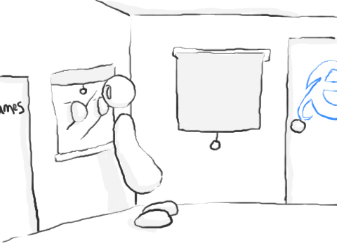
Now, with Windows Phone, the curtains roll up. Each live tile is a window, not just into the phone, but into the big wide world.
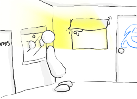

It’s a better way to do it. It really is the evolution of the Windows brand, and fundamentally it gets back to what Windows was all about in the first place. Letting you look into your technology, or out into the wider world.
And the whole ecosystem is going this way. Windows Phone, Xbox, and Windows 8 – all are going to Metro UI, all adopting live tiles and connectivity in a way that makes it easier to immediately gain access to information and interact with technology.
So why do I like Windows Phone? Because it gets back to the original Windows philosophy, the idea that charmed me back in the beige box days. I want to see something open when I look at my technology—not just a bunch of closed doors.


[…] The article, which contains many more illustrations, is definitely worth a read here. […]
wow….like just wow. This needs to be required reading for anyone around computers.
Speaking of required reading, I was in the computer lab at the school I work at the other day and found a computers textbook from 1989. WOW. Required reading from the pre-90s computer era was dark stuff. 😛 I am seriously happy with the pace of progress we have with gadgets now.
This was a good read, thanks. I hope more people realize the merits of the Metro UI.
great blog!
[…] […]
FANTASTIC JOB!!
Outstanding
A UX metaphor that’s indeed nice. Love the accompanying artwork more.
Sidenote: OneSwipe takes away from the “feel” of your site. Its a differernt window into your writings; w/o that tablet tuning it is a lot nicer of a read.
Thanks for the heads-up.. I’m going to look into customizing the touch interface so it better mimics the “clean grunge” look and see how that goes. If it doesn’t better represent the site I’ll just disable it.
Glad you enjoyed it. 🙂
Great article! Thanks for writing.
You are most welcome. 🙂
I grew up in similar conditions, and you hit the nail on the head. As a child that’s basically how I pictured it. Awesome.
Thanks! I think a lot of people did.. I remember how much SENSE it seemed to make that I was looking at windows. Ultimately the functionality was much the same on Mac, but the notion was so much clearer on PC.
You described windows phone exactly the way I see it. Great job and a wonderful article. Could you submit this piece to a magazine or newspaper cause that’s where this belongs not just in a blog. Once again, that was a very wonderful read.
I’m flattered. ^_^ Once I get enough of my illustrated entries together (you can click Stories on the bar to see the others) I’m probably going to put a book together, like Allie from Hyperbole and a Half is doing. At this point I’m not focussing on publication to closely as there are other projects that are taking priority (a play and a nonfiction book) but I’m really jazzed that you guys have been so complimentary. Makes me think there’s something to this after all!
Very cool. I remember when I had a Compy 486 running Windows 3.1 and I tried to delete the “Windows” directory.
It asked if I was sure… I said “yes.” Saw the flying documents poof away and then……. nothing happened. How disappointing! Shut down.
Next time I turned it on, all I had was a blinking cursor at the DOS screen. HAH! Oooops.
Good first education at age 11 with Windows, haha.
I get knocked down… but I get up again. 😉 Part of every Windows user’s development, I think!
Part of me feels like every student should learn on DOS (or similar command line interface) to better understand, in abstract, the structure of their computer’s file system. Part of me is kind of glad we don’t have to do that any more.
🙂 When i got my first computer in 94, i only knew one command… “Format c: /y” so i typer ut and hammered down on the Enter key!!
I usually leve this part out… 😛
The next day i found the solution to my new problem in the DOS 6.22 Manual, putting the 1/3 floppy in the drive and boot.
Keep up the good work!
With regards from Norway.
@thomas… holy cow.. that’s exactly what happened with me…. except I did it on my uncle’s fancy new IBM PC… haha.
(and i didn’t know english, back then, its just a series of alphabets to type in…. )
You earned your Microsoft paycheck, nice work! Sadly, any working knowledge of the history of operating systems renders this article entirely lacking in any truthful merit. I can’t believe these people are buying into it.
Nice drawings though.
Care to elaborate on how the envisioning on his personal experience it is wrong?
Funny how whenever something positive is written about a Microsoft product some people will say writer works for MS but when it is about certain other companies they take it all in.
Open up your mind, companies can change. I’m still on my iPhone but I like the direction of Windows Phone 7 and will try it out in the store when my contract runs out next month.
You should get one and try it for a week or two, you can always return it and go back to the iphone world if you don’t like it, but when you use it for a few days you really see the difference
I wish I was pulling a paycheque from Microsoft, haha. Just a fan of the product and thought it was time someone qualified why instead of engaging in the “we’re just better” snobbery I see sometimes.
Glad you like the art.
I’ll be adding your blog to my list of frequents.
If anything, it’s because you can actually spell ‘cheque’ 😉
So cute! So poignant!
[…] interesting post at the Spillway(brain) blog details why you should choose Windows Phone, instead of Android or iOS. Basically Android and iOS […]
Wow!!! Awesome article and a nice way to view different ecosystems. I love that android drawing with everything turning into a mess and the guy stealing your money made me laugh 🙂
Thanks. 🙂 That was one of my favourite frames to draw… the little thief there was hard to draw because I kept laughing at him. 😛 Hope I get to bring him back in a future entry.
Excellent blog post. WP will really take off once the stigma of WinMo has been banished into the recess of the Mobile Tech landfill.
#WP7 #AmazingEveryday
Hardly ever comment on blog posts. But this?! This is awesome. Thanks for making me feel good about loving Windows. 🙂
That’s definitely part of why I wrote it, lol. I wanted to allow myself (as well as encourage others) to really feel good about using the OS since there’s so much animosity surrounding mobile right now. Especially in the NoDo days, when I first picked up my HTC Surround, there were a lot of hate-ons coming from my friends on iOS and BlackBerry (not many have Android at this point). But when people use WP, actually get hands-on with it for a bit, they tend to acknowledge that it’s snappy and pretty and design-y and just generally functional and good.
We deserve to feel good about the choices we make, provided we can back them up. And since we can, we shouldn’t allow ourselves to be put down for being fans.
[…] Sem Comentários Tweetar Como mencionei o Windows Phone 7 nos últimos episódios do Bent e Throw it Against the Wall [podcastas], acho que é hora de dizer por que gosto dele. Sei que há […]
Nice article, and great images. Everytime I look at my Windows Phone, there’s new stuff on the tiles: appointments, pictures of my family and friends, updates from them, and so forth. It’s just a very pleasant experience.
You hit the nail on the head. That’s one of the reasons I found it very easy to get whimsical about WP.. it’s pleasant and kind of comforting to use, knowing that your info is all there. Brought me back to a safe time, you know?
WOW! What an absolute waste of my time. This article says nothing to justify its title, “Why Windows?”. It is unclear how this UI is different to that of Android widgets for example.
This is the reasoning, thrown in the last paragraph : “Because it gets back to the original Windows philosophy, the idea that charmed me [the author] back in the beige box days.”
Is there a second page to this post that I’m missing?
No, but I think you’ve missed something fairly important on the first page. I make it pretty explicitly clear in the first couple of paragraphs that this is about why *I* like the OS over the competition. So yeah. If you found this a waste of your time, I’m gonna have to say that it’s on you, because I set it up at the beginning as a subjective argument, not a head-to-head review of the major platforms.
You do pose a valid challenge, though: why are WP7 live tiles different to Android widgets, which do also provide dynamic information? While I thought the artwork made pretty explicitly clear my thoughts on the widget model, here’s the Cole’s Notes version in text:
It comes down to implementation, design, and user experience. Android’s wildly varying hardware quality coupled with an uncultivated app ecosystem results in a lot of performance hiccoughs. Further, each individual widget, assuming different developers behind them, carry their own unique UX and UI. And with different hardware, OEM UI overlays, and other issues Android devices have based on the open platform model, covering your screen in dynamic information on Android can become a problematic process. Some phones have the hardware to support it (the Nexus line and the Droid line, I believe, are optimized enough to do that kind of thing), but not all.
Live tiles are integrated into the design aesthetic of the core OS, which means that it’s a far more consistent experience. They don’t make performance chug, they look elegant without being intrusive or overpowering. There’s consistency from device to device in terms of user experience because of the cultivation of the app market and stringent hardware requirements.
So, essentially, you’re willing to go down the lock-in path, as long as things are easy and look nice? Idunno, you may have had computers around you since birth, but it doesn’t show. There’s much more you can do with a computer than just staring at windows, as long as it’s not all just Windows on your device.
I’m willing to buy into an ecosystem with legs, one that I know is going to be around for a while, that does what I want it to and that does it well at a price point that works for me. If a better-suited option comes along, then I’ll use it. There currently isn’t a better-suited option for me than the MS ecosystem. Fortunately, my sunk costs are fairly low, so if I want to jump ship in the future, I can.
And thanks for telling me that there’s more than just the core OS on my computer. All this time spent doing animation, design, gaming, video editing, and audio production and it really never occurred to me there’s more here than the operating system. Thanks, oh wise one, for being here for me.
Wheaton’s Law, dude. Move on.
I like this take on the subject. Best explanation on the value of metro that I’ve seen.
Thanks very much, Stephen. 🙂 I wish this take on it was part of the official marketing. It’d be a lot easier to demonstrate than the idea of a “live tile.”
As a proud owner of Omnia 7, I totally agree to your post. Truly takes a shot at explaining that Windows Phone is the only thing really different (& pleasing) than the other icon filled iphone / androids / etc.
Cheers! The uniqueness of the OS is definitely one of the reasons I went for it in the first place.
yes. no windows explorer so i can actually see the files I want, move them, play them, etc. and Zune! wow. what a life saver. It handles all kinds of stuff I don’t want it to, then makes it impossible for me to set things up the way i want. oh yes…bing, they took the useful features away, made it a button that i push 5 times a day when I don’t want to, that takes me to an app I never use! Oh yes…i love windows (NOT). The way it takes control of SMS, and mixes it up with other messages systems really gives me a moment to pause and yell. I get it all out when using my windows phone.
Not sure what you mean by having no Explorer.. like, on the phone? If that’s what you need, then I’m not sure what would make you happy on a mobile device. Windows 8 will have an Explorer (traditional desktop interface) as well as the Metro UI.
I get what you mean about the search button, though. Any device with capacitive buttons needs firmware (or code baked into the OS) that prevents it from pushing if you slide to it from the screen.
The other stuff.. I don’t have a problem with. Bing is what it is, esp. in Canada. I haven’t noticed a loss in features. Haven’t had issues with Zune desktop either, although it is a little counterintuitive at first (no more than any media manager, though).
Thanks for reading.
[…] a WMPowerUser contest for which I will be adapting to video my last blog entry, Why Windows? I’m pretty excited for it. I’ll post it here when it’s done, this week or next. […]
I have to admit… Windows Phone 7 has me completely. I absolutely love this phone.
I’m an Android user, but I’ve seen a colleagues windows phone in action and would love to give it a go but I’m not afforded the luxury of being able to just try one out. Originally, I thought the ui sucked, but I’m seeing that mango is really delivering a useful experience. Looks like it’s working quite well.
HOWEVER, I’ve played with the preview for windows 8, and, like unity and gnome 3, it just doesn’t work for me (and a lot of other people) on a desktop. On a tablet or mini-tablet (read: smartphone), sure, but it’s too restrictive on the desktop. Especially for more intense users like developers (eg me). It just feels half-baked.
Also, Redmond could take a tip from Android when it comes to user input: one of the cool things about Ann Android device is that if you don’t like the keyboard, you can easily change it. Trace-to-type keyboards like Swype make input on a small touchscreen so much less painful. That colleague of mine swears at his keyboard even though he seems to enjoy the rest of the phone. Swype may not be your first choice and that’s also ok: there are plenty of alternative input “devices” available on the market, often for free.
Android extends this philosophy: my droid looks, feels and acts how I want it to, not how someone else decided it should be. This is another complaint of mine with the windows ecosystem: like apple, accessibility is a joke under windows. For me, it’s just an annoyance applications don’t fit in with my desktop theme or how I want it to look. For others, like a friend of mine, if the application won’t let him define colors and fonts (or rather, just accept his system preferences), chances are good that his myopic eyes just can’t see the application content so he just plain can’t use it.
I welcome technologies that shift paradigms and expectations. I’d love to give a windows 7+ phone a go, but I’m not willing to pay what we get ripped off for phones in south Africa just for an experiment. And I don’t see windows 8 to be the panacea that you do. Also, bear in mind that whilst there is a lot if crappy hardware out there running Android, there are also some really great budget Android phones bringing the internet to people who would otherwise never have been able to experience it. Redmond should seriously consider trying to push an entry-level device – Android is talking over the masses.
At this point I believe the low-spec WP7 devices will begin hitting market around the same time as the Tango update. Possibly Tango 2, I don’t recall exactly. But lower-cost and emerging markets are in the timeline one way or another. The partnership with Nokia especially allows them to tackle it; their supply chain will enable them to get the low-cost handsets out.
You make a really good point about accessibility. Honestly, I’m a little surprised that neither Apple nor Microsoft are pushing accessibility in a big way, especially with the homecoming of so many Iraq War vets on the horizon. Shouldn’t it be a concern? Shouldn’t differentiated colour vision be an option? Better TTY, font control, etc? With boomers aging into seniors, shouldn’t the MARKET dictate that accessibility should be a priority?
I appreciate the critique of Windows 8, but we’re still in early builds–and I don’t think it’s really any kind of panacaea. Windows 9, I believe, is going to be that unifying system, although I don’t remember really where I read that (came from a source saying the next XBox OS is being built on the Win9 kernel). Again, though, there is a desktop interface as well as Metro UI in Windows 8, and Microsoft is listening to the alpha users at this point (see: start screen vs. start menu). I am really excited to see Windows 8 on a quality-built 7-inch tablet. I think that’ll be where it lives or dies, to be honest.
Ultimately I think that Android is a good OS–for those who know how to use it, for those who take the time to optimize their experience, to pick a keyboard and make an informed choice based on their usage, to enable widgets without weighing down performance. At this point, I personally don’t need that level of openness on mobile, nor the hassle, and I prefer the aesthetic and high baseline of functionality (and predictability) of WP7.
Thanks for the comment–a well-reasoned and substantiated post. 🙂 And tell you what–if I feel rich enough to upgrade my phone when I hope to (i.e. in the next 6 months), I’ll get in touch and see if you want to play with this one. It’s already carrier unlocked.
Cheers!
I think Windows Phone 7 has a lot of neat ideas and it definitely makes the best use of typography of any platform I’ve ever seen (if that’s important to you). But the Android analogy is flawed. Your Android home screen only looks the way you depict if you actively clutter your home screen with crap.
Really, Android’s home screen is a superset of WP7’s “live tiles.” Any function that exists in a live tile can be done on the Android home screen with widgets. The same cannot be said in reverse because WP7’s live tiles are rigid, fixed entities and cannot be resized or customized beyond position. So in WP7, you can have about eight pieces of information on the screen at once.
I’m sure there’s some usability study somewhere that indicates that 85% of the population can’t absorb more than that or whatever, but, frankly, I don’t care. I seem to live my computing life in that uncomfortable zone that exists outside the majority of users in usability studies. It’s frustrating. Those same studies almost got us an IE9 where you couldn’t have an option to have tabs on a separate row! Thankfully, the IE team came to their senses before RTM. I say this while staring at 12 tabs at the top of my screen.
So where was I? Ah yes, as cool as SOME of the features that exist in WP7, and as well as it fits some people’s workflow (such as the author’s), whenever I’ve tried a WP7 handset, I felt like somebody taped one of my hands behind my back. So little customization… So many clicks and swipes to get between things because users aren’t supposed to multitask really. So little penetration into the bowels of the system where I can tweak the heck out of the way the system works for me.
Man, that’s why I love Windows and look forward to Windows 8. You got Metro and minimalist for the times you are casually computing and you got a tweaked up Aero for when you need to Get Work Done. WP7 doesn’t follow that philosophy. They stopped at casual, slapped on a reskinned Pocket Office, and called it a business and casual user phone. It’s not.
Thankfully classic Windows is scaling down. By 2015 or 2016, I bet Windows and Windows Phone will fully converge. When I can get WINDOWS on my phone, I’ll dump Android. Until then, WP7 just doesn’t sing to me…
Haha! I was wondering how long it would be until Segeo came up. Yeah, it makes the typeface nerd in me kind of giddy.
The Android frames were meant to be hyperbolic, but also a little more specific in what they’re a metaphor of–maybe the lack of clarity of it is on me, in which case, my bad. It (Android as an OS) is not nearly the disaster it appears to be in the drawing, but my experience on Android has been less than stellar. Ultimately it’s a depiction of UX, not UI, and more to the point the user experience of a particular user or subset of users (I guess, those who wanted Android to be everything they weren’t getting from iOS and found it a dramatically less polished experience).
What I hope here is that subsequent versions of Android make good on the promises that Android made. Better widgets, a better app experience, better-implemented multitasking, more consistency. I know exactly what I’m getting in a Windows handset, spec-wise and UX-wise. I don’t necessarily know what I’m getting in terms of the experience with the hardware itself (I’m less than in love with my HTC Surround’s slider, now that it’s taken a couple of falls and seems a little loose), but the performance of the OS won’t differ from device to device.
Useability studies are a bit of a pain in the ass when it comes to Microsoft, to be honest. The Office ribbon’s appearance in Explorer in Windows 8 is one of those questionable moves that I kind of hope gets reconsidered–or at least is one you can turn off.
I’ll be really interested in what happens in Windows Phone 8 and Windows 9 (I say, while still bouncing up and down about Mango and Windows 8). I think and hope there are some pretty valuable lessons being learned–and not through useability studies, but honest-to-God conversations with users.
Thanks for the thoughts. 🙂
Cheers!
Parrotlover77 (RMS?! is that you? (: ) — you, like so many people think that widgets are all the home screen is about — and your only avenue of customisation. Wrong!
On my handset, I can choose my home app — and whilst some have certain similarities, they all have something different to offer. You can choose from twLauncher, HTC’s Sense, LauncherPro, GO Launcher, ADW, Zeam, Panda, the default gingerbread launcher, a couple of “3d-like” launchers, simple launchers, complex launchers — and even a win7-phone alike! (Though I’m sure that it doesn’t perform half of the neat things that the real deal does). Different home apps provide different functionality, different layout, different levels of customisation on look, feel, behaviour.
The point is, I wasn’t forced into “X tiles” in “Y color” with “Z font” on MY handset. Those days are over. The iPhone suffers the same fate: if you don’t like it the way the manufacturer wants it, TOUGH. Not so fast, handset makers — the little green robot is here to liberate my handset.
Sure, hardware varies wildly — but that’s another *good* point: if you don’t have the top-notch dollar for an iPhone, high-level Android or a Windows phone (and there really aren’t that many of the latter to choose from anyway), then you can still get a cut-down smart phone for a bargain price. Go have a look at the Samsung Galaxy Ace, the Motorola Droid, the original HTC Desire to see how “cut-down” doesn’t really mean that cut down. Or, travel further down the spectrum to look at the plethora of cheap phones that are taking over the African continent right now. People who can’t access a PC or laptop, who can’t spend thousands of dollars on a shiny machine, can maybe afford to get a Huawei or some other cheaper Chinese brand. This is technology for the masses, no longer the domain of the fiscally elite (yes, you and I fall into that bracket — I bet, like me, you have more than 2 computing devices in your home!).
At the end of the day, this is the great divider between Android and the others — choice. You choose your firmware (more and more vendors are openly unlocking phones for people to load them how they see fit). You choose your look and feel. You choose your hardware. Ultimately, you choose your experience.
Maybe you don’t care about the choice — but I do. And like a visually-impaired friend of mine, so do many others.
And it’s this lack of choice which has always been a bugbear of mine with Windows. Theming sucks — it doesn’t matter what theme you get, ultimately, unless you choose something close to the default, there will be some app you can’t read or use. Again, more of a big deal for some than others. The windows 8 tiles “home screen” is great for a tablet — I’m not convinced for mouse navigation just yet, especially after you get a new machine with all of the vendor’s crap installed — two or three screens later you’ll find your stuff which you’ll have to move where you can see it. Sure, you can just type to search — my wife won’t want that. My gran either. There’s lots of people who have been taught to drive with the mouse, so they do. The “desktop” in win8 is a joke — it’s not like you can really live there — it’s tiles or die. I think that windows 8 will provide a very steep learning curve for PC users and a frustrating experience for tablet users on the PC where you can’t quickly swipe to pages of interest. Personally, I think that the interface design for win7 is the best Microsoft has done so far — easy to use, out of the way, relatively efficient.
Once again, I welcome new paradigms which shift how we do things — when they work. Win8 has yet to convince me. Windows phone looks intriguing, but I’ll probably never spend the couple thousand rands I would need to to “try it out”. Now, if my work could buy me one…
“At the end of the day, this is the great divider between Android and the others — choice.”
You’re pushing Android awfully hard here *over* the other platforms–might I suggest that choosing a more closed platform IS a choice, and a valid one?
HTC Sense is GORGEOUS, yes. Yes, you can uninstall it in favour of Cynaogen or whatever, you can dive deep into the nethers of the OS and make your phone do backflips. You do have openness and choice. You can spend hours cultivating your experience to the point where it is exactly the one you want.
That’s pretty damn cool, and was why I was very close on several occasions to shelling out for Android devices.
However, I’m realizing more and more that I don’t want to have to do that. I don’t want to root my phone, to have to micromanage my technology. Maybe on my desktop PC, but I want my mobile stuff–i.e. laptop and phone–to just simply work, and work well, without the investment in time.
That’s the choice I made. If Android at some point offers the kind of stock experience I prefer, AND offers me the opportunity to play with the nuts and bolts, then so much the better. But for now it’s not *everybody’s* best option.
[…] a snapshot, read the full article here. There are cute graphics along the way to explain the author’s […]
Ah Trevor, it seems like the phone is on such a good track…
…but from here it seems like MS’ marketing team is out to destroy the phone.
I dropped some thoughts about marketing here: http://learningaspmvc.wordpress.com/2011/11/09/windows-phone-marketing-still-feels-half-assed/
Yeah, it’s kind of been one gaffe after another on the marketing front.
Whether it’s the ads themselves or failing to push into the point of sale (as you observe in your article), Microsoft is just not keeping up with the other OS makers nor the OEMs when it comes to promotion and marketing.
Even RiM is doing a better job of pushing Blackberry than Microsoft is of pushing WP7. And isn’t that tragic.
Funny, it’s a good morning read 🙂
While I agree with (and share) your feeling around how stuff is organized and presented on the various smart phone platforms, I think you missed some of the main points why people do or should love Windows Phone… to me it’s all about how stuff/data/people/services/feeds are well integrated.
Take the “people hub” as an example: it aggregates your contacts from corporate email, personal email, twitter, linkedin, facebook, etc. into one nice list of contacts, combine all relevant details (coming from different places) into a nice view on that person (i.e. no duplicate contacts), and then, most importantly, lets you take all kinds of actions right from here. So it all starts with that person you want to somehow interact with (send and email or SMS, call, post on wall, read statuses, map address, etc.).
You want to get to your friend’s place from you stand now? No worries… look up that person, hit “map home address” and hit directions. Voilà. You don’t open contacts, copy address, close contacts, open mapping app, paste the address, hit find directions, find me, etc.
Interestingly enough, my galaxy s has been doing that for well over a year. Most of it isn’t what I particularly need (I know where my friends live and I don’t actually have sources of truth for their addresses, but I input mine and found that tapping on opens google maps). So you haven’t convinced me that windows phone is all that special, but you have made me learn more about my device. Thanks (:
[…] Почему именно Windows? […]
Great article and perspective on Windows. I grew up about the same way, sounds like, mixing devices and getting in on the ground back in the late-eighties. And I liked the Commander Keen helmet & weapon.
I’m glad somebody caught that at last. 🙂 Thanks for reading!
Hi I don’t really understood the last portion of the article where you describe the differences of having “windows” rather than “doorways”.
Isn’t doorways just like the windows you mentioned? where you can always look at the contents in the doorway too. And soon enough, the spartan doorways with the crook in it will have an equivalent setting of a mess of “windows” with a crook coming from a window too?
regards
in addition, where live tiles are out into the big wide world, isn’t those widgets/doors also connected out into the big wide world?
regards
They’re completely different analogies for the delivery of information.
The “live tile as window” analogy means simply that you can look at a live tile and see dynamic information. You can drill deeper and get more info and functionality, but it provides information directly on the tile.
The “icon as door” analogy refers to having to actually open the app to get the information that the live tile displays natively. Yes, the doors are still connected to the wider world, but you can *see* the wider world through a window.
While this is not universal across all apps, it’s the design philosophy that differs.
Conceivably, yes, there will be at some point piracy and theft, viruses and malware on WP7, but I was poking fun at Android’s problems to date, not making a statement about the future of the platform.
One of the better reads (read: creativity) about Windows Phone from someone who REALLY appreciates the system. 🙂
You share the same mindset I have about Windows Phone and the other systems. 🙂
I was to get the iPhone because it had MANY apps. (cough*Angry Birds*cough) The thing is, it needed those apps just to do justice the ownership of an iPhone.
I saw a Galaxy S2, played with it a little, and initially, I liked it. I was supposed to get it, but the next day, it was gone. (We can only afford a second-hand phone. The unit I played with was around $400. A new one was around $700.) I thought that I was at a loss because of that. Specs-wise, it seems nothing could touch it, But then, I got thinking- It was a little complicated. Widgets left and right. Processes working and shutting down. Complications. I was overwhelmed by them.
I saw an HTC HD7. Windows Phone. I played with it a little, and it struck me instantaneously. The tiles. The Facebook integration. Zune. Microsoft Office. The information I want, all without the laborious process of opening an app, and closing, and re-opening, and re-closing,… The clean interface. Speed. Speed. Speed! (I was fed up with lag. I had enough of it with my laptop.)
Again, this is one of the better reads about Windows Phone I have seen. Great job you have done on this one 🙂
P.S. : The “mess” that is Android that you drew here? SO TRUE. (Even the guy stealing your money- that is also true. 😀 )
Thanks for the kudos. 🙂
I do feel like I need to make a disclaimer about Android, though, since it’s caused some ire. I don’t think Android is an inherently bad platform–it’s just got observable problems with UX, and my personal experience–much like yours–was pretty poor.
Honestly, I HOPE that Android fixes its UX issues. I know it’s heresy to say this, but I wouldn’t be surprised if Google starts closing the system more and more in order to cultivate that.
Glad you’re enjoying Windows Phone. I feel like WP7 could easily borrow from the Keith’s beer commercials–“those who like it, like it a lot!” And I’m glad I contributed a bit to the discussion.
Cheers!
Hi there! I have to say that I didn’t feel inspired by your writing, your arguments seemed to me so weak and absurd at first, and I’m sorry for it, but they aren’t, it’s your viewpoint and as so it is valid and respectable, I’ve been looking for reasons to have one of these phones, and will have one. I remember well those days of DOS and win 3.1, those days wen I felt for the first time how is to program a computer and see your program “alive”.
But again, I, personally won’t use nostalgy nor analogies to windows to jump platform, yet I will seek for one and taste the different platform, and hope will be a good one.
Have a nice day 😉
Hi there!
http://spacegypsies.com/media/2011/07/Don__t_be_a_Dick_by_Lazorman8-240×300.jpg
Always try before you buy, and if you’re going to chirp someone’s writing, use real words (nostalgy?) and avoid run-on sentences.
Have a nice day. 😉
That was unfair. I just was honest about my first thoughts. It’s just that I came here looking for an opinion in the platform.
But you replied so aggressive.
Thanks for “nostalgy”, I was wrong, it’s nostalgia, I know another word 😉
Good bye.
Tell you what–you’re right. I was more brusque with you than with other people who commented things so similar as to be virtually the same thing, so you deserve the same treatment–even though bringing something up in the comments thread after it’s been addressed several times is pretty troll-like.
The point is not to provide a consumer review, and it’s not to convince people to use the platform, either. The first couple of paragraphs make it abundantly clear that it’s about user experience and, more specifically, my experience with the platform. I’m not presenting arguments for or against this platform as opposed to other mobile OSes. I understand that you came looking for something other than you got, but if you got past the first couple of paragraphs and still expected something other than it is, then that’s frankly not my problem.
As for an opinion on the platform–it works. It’s roughly feature-equivalent with the other major phone OSes. I say as much in the piece. I like the dynamic information displayed on the live tiles, and I think it’s an appropriate way for Windows to evolve based on the evolution of the technology we use. I don’t break it down like that in the piece, but that’s the take-away most people seem to have.
When I say “try before you buy,” I meant it, though I wasn’t too clear on *what* I meant–you should have hands-on with the OS before you choose to adopt it as your primary mobile device. It’s not going to work for everyone–just look at the conversations above re: Android vs. WP7.
On second glance, your comment wasn’t as trolly as I initially thought. Sorry I jumped down your throat; I’ve been sleeping pretty poorly this week and the run-on sentences (periods, man!) hid the fact that you weren’t being as much a dick as you came across as when I read it this morning.
Lesson learned: wake up fully before responding to comments. I usually have a rule that if I’m not making sense of something, I’ll leave it alone, but I seem to have forgotten it today. Thanks for reminding me.
Cheers,
Trevor
Thanks for the comment, and by the way, I didn’t explain myself rightfully, so it’s not all your fault.
And about platforms, there are lots of info on specs, speed and so on, but few abut what it feels like to actually use a platform, your post covers that point, but its not easy to see it at first, and that experience is what I was looking for.
Have a nice day.
PD. Nice pics 😉
This was amazing. Very refreshing as well. I work with the platform every single day and sometimes it gets tiring hearing negative comments. This was defintitely a fun read. It also reminded me that I’m not crazy for loving my phone. 🙂
Thanks very much for the kind words. 🙂
You work with the platform–are you a developer?
I’m with the marketing team.
Wow–! Welcome. I was tweeting with a couple of MS guys earlier in the week and they mentioned they’d refer some marketing people this way, but I wasn’t really expecting it.
If you dug the blog, stay tuned tonight and tomorrow.. I’m going to be posting a minute-and-a-half video version of the blog for the wmpoweruser.com contest.
Thanks for coming by. 🙂
Never expected the descent shupu in the Gámez room. Hi5!!!
Missed this one. SOMEONE ACTUALLY CAUGHT IT! 😀 High five!
[…] Amazon may be planning smartphone. I love my Windows Phone! Why Windows? “The White House says there is no evidence at all that earth has been visited by aliens. Do […]
[…] is a great article describing what it is about Windows that drew people into personal computing so long ago and why […]
[…] ago, WMPowerUser.com posted their call for video entries for a contest. Seeing as I was writing Why Windows? at the time, I figured I couldn’t go wrong adapting it to video. It answered pretty […]
[…] of explaining why, in better terms (and prettier pictures) than I really could. So read away! http://spillwaybrain.wordpress.com/2011/11/10/why-windows/ December 13, 2011 – 6:34 pm | By Shayaan | Posted in Mobile | Comments (0) ← A time […]
I just switched from Android to WP7, and I thought your post was spot-on. I used Mac and PC concurrently since primary school, but my first computer when I started university was a 386 SX/16 running Windows 3.1 and DOS 6.22, and I have never regretted my decision to hitch my wagon to the Windows platform. A bad day on Windows still beats a good day on Mac, and since I spent my entire college career using and supporting the Mac platform, I’m not just drinking the Windows Kool-Aid either. I’ve used Windows phones from back in the day – the HP iPaq hw6515, running Windows 5 (I think), and the HTC Pure running Windows 6.5 – and I can honestly say that MS hit the ball out of the park with WP7. After 18 months with my Android phone (the last 3 or 4 of which I spent fighting ridiculous “low storage space” errors on a phone that had over 6GB of free storage), using my WP7 phone has been a joy.
And for your invocation of the Wil Wheaton “Don’t be a dick!” JPEG, you became my personal hero. 😉
Haha, thanks for the comment.. and I can’t say no to being someone’s hero. 😛
That was a fun read!
– sent from my Dell Venue Pro Windows Phone =)
The elusive Dell Venue Pro.. how do you like the physical keyboard?
(Also thanks. :P)
As I don’t have access to a current Windows phone I’m curious about a few things. For instance, can you tell me what the difference is between having live-update widgets in Android and the ’tiles’ in Windows Phone 7?
If I had a home page full of resized widgets which, like my mail box, can be altered to give me a current view of (eg. new mail) without opening anything, how would this be different?
Good question. I’m going to try to explain to the best of my ability, because my understanding of the background tech is a little fuzzy.
Difference is in two things: OS architecture and how the information is displayed.
Android, up until ICS, hasn’t had the OS functions on a higher-priority thread than app-specific stuff, like widgets, apps, etc. When you start loading up your screen with widgets, you start increasingly compromising core OS functionality. Again, I believe the threading issues have been worked out in Ice Cream Sandwich but don’t quote me on that.
Contrarily, Windows Phone has all the core OS stuff on its own thread, meaning that you can load it up with live tiles and not experience jenkiness the more dynamic information you display.
Further, it’s about design. Load up your home screen with widgets, you’re going to get some clutter. Conflicting design, information overload. Windows Phone makes use of geometry and negative space to separate the information out so that it’s never cluttered, so that you can digest a great deal of information without overload.
Can you do this on Android? I mean, sure, if you spend a lot of time cultivating performance and managing your widgets. If you’re just slapping widgets on there haphazardly there are going to be problems. But I know that pretty much whenever I add a tile, it’s going to do as advertised.
Hope that all made sense. I’m fighting a head cold and (embarrassingly) have just rolled out of bed. 😛
Cheers!
Trevor
Great article undoubtedly but I could tell you why not windows for now in a single line. Windows phone 7 has no file manager and also no bluetooth transfers. My sony ericsson t700 can do that and it costs 1/3rd of a windows phone. I like the ecosystem alright but microsoft has to understand bluetooth transfers are something people use a lot. Besides to top it up now the sms bug which crashes the messaging hub.
It’s about priority, right? If Bluetooth file transfer is a thing you need, then yeah, I guess it’s a dealbreaker. I haven’t even noticed not having it. I wonder if MS is thinking that NFC is going to be the way to go for file transfer going forward–I think it’s going to be supported starting in Tango or Apollo.
Cheers,
Trevor
The issue with no file transfers and no file manager could be simply because of piracy. That’s the issue with Android, you can download music files illegally and even download premium apps apk for free somewhere on the net, and it does hurt the economy real hard. To be honest, I did download illegally on my galaxy and shared those stuffs to my friends, but comming to thing of it, it is just not ethical. Piracy is stealing no matter how you put it. I know some guys would hate me for this comment, specially those guys who sang SOPA CABANA, but no matter how you put it, it’s better to buy a product legally, who knows, maybe your money just made a fresh grad get a job, or even helped guys like mr. Gates feed more hungry kids at Africa. Software piracy or I mean any sort of Piracy only benefits people who have money but isn’t willing to spend it. Come on, have you heard of a bum that got a smartphone? MS is just doing the right thing preventing piracy, and they do know how bad it is for they themselves are victims of it. People wont stop advocating piracy, and so there you got, an OS that restrict you from doing so.
[…] http://spillwaybrain.wordpress.com/2011/11/10/why-windows/ […]
A great article….
Windows Mobile 6.5 is a very good mobile OS, actually it’s my favorite, I don’t see any reason to switch to WP7 for now…
If you say so. I really wanted the HTC Touch Pro 2 but I couldn’t bring myself to pick it up after using it. A rare case of the hardware being more compelling than the OS.
I understand that WM6.5 has a lot of fans, but it seems to me like it really works for a specific use case and not many others. I personally don’t like the way it looks or behaves–on a device I use as much as my phone, I want it to inject a little joy into my day. WP7 does that where WM6.5 just didn’t.
That said, we’re coming back to a common theme in this comment thread–use what works for you!
Excellent! We just need to expect that MS doesn’t loose this great chance to homogenize the platform and have happy users of phones, PCs and finally, tablets. The vast majority of computer users has an acceptable median knowledge about computers, PCs with Windows.This is the big potential of MS in the market: people knowledge of Windows (already conquered by each one of us in different levels). MS need to use this legacy wisely, aiming to really offer better options in evolution of this knowledge, allowing people to feel safe to go far away with phones and tablets in a previous known way. This is urgent. 2012 is THE year to do this!
Love the enthusiasm. 🙂
Do not pick windows ! They suck at apps & they do not have one popular app “words with friends”
Hey, downvoters–the app situation is admittedly a little grim. That said, I have been pretty happy with a ton of the apps I’ve gotten, but I’d love Words with Friends.
This is great!
Cheers. 🙂
I chose Windows Phone because the UI is great…and well put together. I like the integration of my friends, and social media. I like the fact that I can get on my phone, send a message, and be done quicker than any other system. I like the fact that I spend less time screwing around with my phone, and more time on life.
Holy crap, the first round of ads have COME TRUE!
:p
Honestly, I like that too. I don’t need to be glued to an app for ten minutes to perform simple tasks.
Thanks for reading!
This is basically what I tell my friends. With iPhone, you have to tap on an application to view the content, which is annoying if you just want to know the weather. And Android’s GUI is so messed up it’s not funny. But with the WP7, all you have to do is take a glance at a live tile and your done. If you want more info you can tap on it. Simple and easy to use.
Yet iPhone is still #1 in the market for some reason… And I hate it
I like my windows phone too, but the lack of Groups in both the official Facebook app for windows phone as well as in the People Hub disappoint me. As a keen member of several groups it is annoying not to be able to respond to notifications ect.
Recently I also go the ‘disappearing keyboard’ bug. It seams that the cause might be the background tasks. Very annoying since disabling the background tasks is like cutting half a leg of the idea behind the live tiles.
I hope the phone-team addresses these issues soon.
I read somewhere that 8107 will fix that keyboard bug, but I can’t find it now. :/
Thanks for reading!
That was a real fun read! Comments too 😉
[…] […]
I have to say that I really enjoyed reading this, well written and very well presented. I started with WP7 in 2010 when I got the Omnia 7, unfortunately a couple of bugs and delayed updating of the OS put me off the handset. However, after a couple of Android handsets (Nexus S, Atrix, Desire and Hero) I have now returned to WP7.5 with the Nokia Lumia 800.
It is, so far, one of the best handsets I have used and now Microsoft have updated to Mango it is a lot better. Even though I use Macs at home Windows will always have a little place there because I, like you, have spent many years with Windows PCs.
Excellent post.
I’ve just gotten over my jealousy about the Lumia to reply to your comment. 😉
Thanks for the comment, and it’s nice to see someone who’s been in another camp for a while come full circle to Windows Phone.
Windows originally meant open applications that you could switch between and close selectively. I can see where you’re coming from, but wouldn’t you rather be able to customize where and what color (if you get my meaning) the windows are-the customization. I for one would much rather live in a house I designed or at the very least different than the others than in a house that looks like all the others. I know that Android and iOS just don’t cut it (Maemo/MeeGo maybe?) but imho neither does Windows Phone. I tested a Nokia Lumia and was not impressed. I thought the OS felt closed and constricted without a lot of options for easy visual customization compared to my Nokia N9. Great story/blog post though..
I’d rather live in a house I designed, too.
But I don’t have the time or will at this point to design a house, It’s a big job. I want to tweak things about a house I like that’s been built for me, not build it from scratch.
I saw an N9 in the wild the other day for the first time and was pretty impressed. That said, the OS–wall of icons. I’m pretty tired of walls of icons. I’m happy to give up a bit of openness in my mobile OS for a cultivated experience and dynamic info.
Thanks for the kudos, and the comment. 🙂
My first PDA was a packard bell with Pocket PC on it. after that I owned a lot of Windows Mobile devices. And also 2 Windows Phone handsets. Now I am about to switch to android 4.0 because it seems nicer. Surely WP7.x has some features which make it stand out and mango brought a lot of nice features but fails to move me in any way. I remember when the HD2 came out I spend 4 days confused; one side feeling bad I just spend £600 on a phone and the other side excited to own the device. My HTC Mozart felt wrong all the way. Especially when the battery drain started with mango. I now own an HTC radar and yes its a great device in the sense of battery life – would describe it immortal in comparison to the latest handsets, screen quality, network speed etc. Which also puzzles me why is it so much cheaper than the other handsets as they are pretty much the same specc with a couple of accessories been better in some. For example, Nokia Lumia 800 been the same price as HTC Titan and the HTC radar been 100 pounds below both.
Interesting point on the price–maybe HTC’s supply chain for the Radar parts is maturing?
I’ll be pleased to get a Nokia Lumia 900/Ace when it launches. I use an HTC Surround and I don’t mind it but I think I’m over HTC’s hardware too.
this why windows phone 7.5 is best smartphone. just wait 2012 will be windows phone 7.5 year and beyond. Windows phone already blew away blackberry phone off the market. Maybe all the apple fanboys trolls and android r2d2 trolls can learn a lesson here and realize there phones are just a piece a crap all along and realize there apps are just boring and sits there Dead…
Great post!….Does any one know why Nokia Lumia phones don’t support file sharing using bluetooth? I haven’t personally used the any of the 2 devices, but that’s what i’ve been reading on the net.
Huh.. second comment about Bluetooth filesharing. I really did not think it was a thing. 😐
I imagine that it’s a UX thing. Bluetooth file transfer is pretty slow, right? WP7 is a fast, smooth OS. And with syncing over WiFi and to Skydrive, it’s becoming a less- and less-used feature.
Interesting read and @Windows just tweeted it so expect a flood of comments!
I get your analogy and can see why live tiles appeal, although maybe it’s a sad reflection of an overstressed world if the ‘chore’ of having to click on a an app/widget seems too much effort…
Whilst the interface itself looks great (and metro W8 too) the lack of killer apps in marketplace is still the biggest turnoff for those used to Android/iOS markets – needs to improve quickly to gain momentum or Windows Phone could, rather perversely, become like the Mac – great UI and OS with less problems than its main competitor but missing the dominance and killer programs that Windows enjoys.
It’s not so much about it being a chore–there’s still very much a lot of tapping on live tiles to launch the apps. 😛 It’s more about being able to consume more information. If you check out the video I did for the WMPowerUser contest, I used the tagline “See More,” which I think is the most fundamental thing about WP7 that’s beneficial. It’s about getting more, not doing less.
I agree about the apps, though. Still wondering about a few things. Of course, I’m mostly working off the free/ad-supported apps, not the paid ones, so I’m maybe not getting the best experience.
Just thought I would take a minute and comment. Whenever my friends as me why I like Microsoft products so much, in not sure exactly how to explain it, but you hit the nail on the head with this post and your comments. I believe that the metro UI is the best idea for a UI mainly for the ease of use, the way it keeps the screen from being cluttered and how it puts people first. The only downside to windows phone is the lack of apps, but I know they are coming! I am always showing off my phone trying to get people to realize that there is more out there than iPhone and Android, and it just might be better! Thanks for the great read!
Just thought I would take a minute and comment. Whenever my friends as me why I like Microsoft products so much, in not sure exactly how to explain it, but you hit the nail on the head with this post and your comments. I believe that the metro UI is the best idea for a UI mainly for the ease of use, the way it keeps the screen from being cluttered and how it puts people first. The only downside to windows phone is the lack of apps, but I know they are coming! I am always showing off my phone trying to get people to realize that there is more out there than iPhone and Android, and it just might be better! Thanks for the great read!
(Sent from my HTC Trophy)
OMG1 Diz Iz Coollllll!!!!! I like how u draw them picturez! make another 1 liek dis.
Reblogged this on .:|k|w|p|b|:. and commented:
Ein lustiger Artikel über die “Windows-(An)sicht” der Welt …
Excellent article! It was very creative and I love the pictures! I love Windows and far prefer it to Mac, but I don’t believe I will ever get a Windows Phone. At least, not in the near future. Though, I must admit, the Nokia Lumia 900 looks really good right now. I <3 Nokia
I have always been a phone junkie, I have had over 30 phones and it is a very personal device for me. It represents my personality. So, as you can probably imagine, I have an Android.
And, despite what everyone says, I have no problems with the user experience. Part of it is due to the fact that I usually have the latest hardware, but essentially, Android is what you make it. You can make it bland, you can make it chaotic if you're not careful, you can make it laggy, you can make it snappy. I realize this could present a problem, but I like that control over my device. I love the customization. I love notifications bar (which iPhones finally stole haha). So much can be worked and tweaked with rooting, but even without, the possibilities are limitless.
Granted, this is merely my personal opinion, but box that iOS and WP7 put you in is a deal breaker for me.
And finally, until they get some apps, I probably wouldn't recommend this platform. But there is potential if they can find some devs… Haha
[…] all know that I am and have been a fan of Microsoft products. I love me some Metro. My Windows Phone actively makes life more enjoyable. […]
[…] all know that I am and have been a fan of Microsoft products. I love me some Metro. My Windows Phone actively makes life more enjoyable. […]
[…] …log in with my Microsoft account (that I already had from my Windows Phone fandom)… […]
[…] enough, even though I use and love Windows Phone, I wasn’t too heartbroken with the news. After all, it’s been up in the air as to […]
[…] http://www.pcworld.com/article/255508/siri_says_nokia_lumia_900_not_apple_iphone_is_the_best_smartphone_ever.html I don’t intend to compare Nokia Lumia 900 to iPhone here. Yet it does not take a genius to figure out the implication of the public acknowledgement of this phone behind the story. Windows Phone’s Metro UI allows you to have selective information based on your personal interests on the home screen. One glance and a few clicks from the home screen, you know everything you care about. It saves you the hassle of finding and launching apps that you have to do on other platforms. There is an insightful article on Metro UI and its advantages over other UI design. I recommend everyone who’s eager to know more Metro UI to read it. http://spillwaybrain.wordpress.com/2011/11/10/why-windows/ […]
Excellent post. I was checking continuously this blog and I’m impressed! Extremely useful information particularly the last part 🙂 I care for such info much. I was looking for this certain information for a very long time. Thank you and best of luck.
I like your blog
How do you save your bookmarks in Firefox when transferring from one computer to another?